|
Philosophy and Culture
Reference:
Wang X.
Principles of color formation in Chinese painting and ceramic painting
// Philosophy and Culture.
2023. ą 8.
P. 139-147.
DOI: 10.7256/2454-0757.2023.8.43702 EDN: WRDHXO URL: https://en.nbpublish.com/library_read_article.php?id=43702
Principles of color formation in Chinese painting and ceramic painting
Van Xingqian
Lecturer, Art Department, Anyang Normal University
191186, Russia, Saint Petersburg, nab. Sinks, 48, room 6, room 51

|
wangxingqian@rambler.ru
|
|
 |
Other publications by this author
|
|
|
DOI: 10.7256/2454-0757.2023.8.43702
EDN: WRDHXO
Received:
03-08-2023
Published:
01-09-2023
Abstract:
The art of traditional painting and ceramic painting in China has a long tradition, in particular in understanding the role of color in the compositional and semantic structure. The principles of creating a color image have long been associated with national peculiarities of perception of shades and their combinations, as well as philosophical ideas. Technological features and properties of glazes imposed certain restrictions on the use of expressive possibilities of color by Chinese ceramic artists. The object of this research is the works of Chinese painting and ceramics, the subject is the principles of color formation in these arts. Particular attention is paid to identifying similarities in approaches to color transfer in paintings and ceramics. The author's special contribution to the study of the problem is an attempt to characterize and compare the role of color in the art of Chinese painting and ceramic painting. The article defines a number of general principles of correlation and harmonization of colors in the two arts. The traditions of the color formation of works of various epochs are traced, the peculiarities of their evolution are established, the colors characteristic of painting and painting ceramics of different historical periods are revealed. The article examines the essence and symbolism of different colors, which are based on national philosophical and cultural ideas. The conclusion is made about the significance of the color image and color formation for the works of ceramics and painting in China.
Keywords:
ceramics, painting, chinese art, principles of color design, color image, celadon, glaze, qinghua porcelain, the concept of five colors, cultural and philosophical ideas
This article is automatically translated.
The "face" of Chinese art is ceramics and ink painting, which have a long tradition of color organization. It is noteworthy that the principles of color formation in Chinese traditional ink painting and in paintings of ceramic products have much in common. The study of such a relationship with respect to the role of color in both arts will allow us to better understand their uniqueness in the past and, perhaps, determine the ways of development in the future in the context of the most vivid and very important means of expression for the national culture of China – color. Meanwhile, this issue has rarely been raised in the studies of both Chinese and Russian art historians and historians. So, if the place and semantics of color in the space of fine art in China has long been the object of attention, then the problem of the dialogue of arts within the framework of color formation, the proximity of concepts and approaches remains a debatable and little-researched problem. The most striking example of the role of color in Chinese painting is one of the earliest independent paintings – a painting on silk "A Lady with a dragon and a phoenix" (see fig. 1) by an unknown artist. The key element in it are the lines made in black ink. For such works by Chinese artists, in general, the presence of "minimal decoration", "lack of multicolour" is characteristic. The faces of the characters, as a rule, are painted in the technique of retouching and painted in a light ochre color. There are faint shades of green, red, white and cinnabar on the items of clothing and on the background. Sometimes in the image of the foliage of a weeping willow, made with one touch of the brush, there are inclusions of malachite color. Such works are characterized by "sophistication and refined taste" [1, p. 95]. 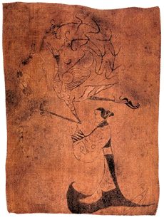
Fig. 1. The author is unknown. A lady with a dragon and a phoenix. Painting on silk, 31 x 22.5 cm. The Warring States Period (476 – 221 BC) Hunan Province Museum. The tomb of Chu was discovered by Chinese archaeologists in 1949 in the southeastern suburb of Changsha, Hunan Province [2]. Even during the Northern Wei Dynasty (386-534), mineral paints, mainly dark brown, were widely used in Dunhuang fresco painting. So the style of Chinese painting with clear outlines and rich colors was gradually formed. The masters tended to use black with small splashes of red and other shades. The color scheme of fresco paintings varied from the "pale purple" monochromatic painting of the Song Dynasty (960-1279) to the principle of "applying colors according to the object", formed during the Five Dynasties (907-960) [1, p. 96]. Thus, the tradition of color formation in Chinese painting was reflected in the colorfulness and monumentality of fresco paintings, the elegance and subtlety of lines and spots of painting on scrolls, as well as in the abundance of fiery red shades in the splint paintings. If in painting the color depended on the composition and properties of ink, the characteristics of paper, then in ceramic products it was determined by the natural color of clay and ceramic glaze after firing. It was the latter that provided Chinese ceramists with ample opportunities for the color design of porcelain products. In the era of the Tang Dynasty (618-907), a system of "southern blue-green (see fig. 2) and northern white" was formed [3, p. 22]. It reflected the regional style of decorating with colored glaze with its division into chromatic and achromatic colors prevailing in different parts of China. Such a variety in the use of color in ceramic products indicates an attentive attitude to this problem on the part of Chinese craftsmen. 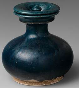
Fig. 2. A vessel with a lid. Ceramics with blue glaze. Tang Dynasty, VII century. China. Height 16.5 cm; diameter 15.9 cm. Metropolitan Museum of Art [4]. In the southern provinces, the so–called "celadon" (see fig. 3) - "smooth porcelain of the color "Qing" was widespread. It consisted of "ceramic products, on the surface of which a glaze containing iron is applied, and fired in a reducing furnace" [5, p. 24]. Iron oxide in the glaze ideally gives a characteristic blue-green coloring. However, if the temperature of the reducing atmosphere in the furnace is insufficient, the products may acquire a yellow-brown color. Therefore, "celadon" is not only blue-green, but also yellow and brown [6]. Interestingly, the color "qing" also does not have a clear definition among residents of southern districts. For example, vegetables of the color "qing" are green, and the fabric of the color "qing" is black for them. At the same time, the sky of the color "Qing" is blue. This feature of color perception and interpretation is also proof that the color scheme of the southern celadon glaze is more diverse and variable compared to the achromatic northern glaze, and is also associated with local peculiarities. 
Fig. 3. A bowl with the image of dragons and waves. The era of the Five Dynasties. China. X century. Carved decor, celadon. Height 11.4 cm, diameter 27 cm. Metropolitan Museum of Art [7].
Glaze as a thin layer of vitreous coating applied to the surface of a ceramic workpiece has the same physical and chemical properties as glass. As a rule, quartz, stone and clay are used as raw materials. The chemical components are oxides of silicon, aluminum, iron, titanium, calcium, magnesium, potassium, oxide and other oxides. In combination with the various metal oxides and firing atmospheres available in the composition, the color range of the product can vary from blue, black, yellow, red to blue and purple. A certain degree of unpredictability of the result, especially within the framework of ancient technologies for the manufacture of ceramic parts, led to the appearance of interesting and spectacular color combinations. Such bold "experiments" in the painting of the past were practically impossible due to its canonicity and the properties of ink [8]. The color characteristics of ceramics made it possible to use expressive means of color more freely. Due to the specific behavior of the glaze during firing and after it, the tonality of the colors of the painting changed. So, a landscape made with a similar glaze on the body of the vessels could be fixed in dark yellow, sky blue, yellowish-brown, steel gray and other colors. The brightness of the images also changed. For example, the shades darkened or, conversely, lightened. In the northern regions, when referring to the favorite white and black colors, the masters took into account their contrast in brightness when painting, as well as the fact that as a result, the colors could be muted in their strength. The perception of the color gamut in ceramics was influenced by the degree of coloring (chromaticity), that is, the degree of purity of color. As you know, sunlight through a glass triangular prism can break up into red, orange, yellow, green, blue and purple, that is, the basic colors. They can be mixed with other similar colors, getting different shades, such as red, red-orange, orange and orange-yellow. Yellow is a warm color, and blue is a cold one. Warm colors give people a sense of spaciousness, and cold colors give people a sense of compactness. In the ceramics of the Tang dynasty, the masters sought to use a combination of the purest and warmest colors, and the works of the Song and Yuan period (1279-1368) are characterized by monochrome and coldness. So, the painting of the dishes of the first creates a feeling of warmth emanating from them, and the images of flower buds on them seem to open up to the viewer [9]. In the works of the latter, the clarity and rigor of the silhouette dominates, which color helps to identify. According to scientific research, color affects a person through the visual perception channel and depends on the emission of light of a certain wavelength perceived by the eyes [10]. The reactions of the optic nerve to the effects of light are different, which indicates the direct influence of color on the psychology of people. Moreover, in China, such ideas have entered into the concept of "Five Colors" in connection with natural phenomena and human virtues, his condition. Of course, Chinese artists took this property into account. So, the green color creates a feeling of calm and comfort, it can relax, calm the nerves. The natural green color also has a certain calming effect. However, a long stay in a space with green shades causes a feeling of desolation and desolation. Perhaps that is why Chinese masters sought to use it when painting ceramics and decorating paintings in a moderate, fragmentary way. Blue in the concept of "Five Colors" is a strong enough color and is directly related to green. It is an excellent stimulant of imagination and inspiration and has a calming effect on the nervous system. Yellow is the most important "imperial" color in the concept of "Five Colors" and the first color that people recognize after birth. This is a color that symbolizes health. Its brightness is due to the fact that it has a high absorption spectrum. Yellow is able to stabilize the psychoemotional state of people. Red is the most exciting color, which acts as an aggressive and exciting stimulus. Traditionally, it is associated in China with the flame and the sun, and is also an important element of any celebration. Pink is a derivative of red, which is a direct personification of tenderness. Achromatic white color reflects all the light of the visible spectrum, creating a feeling of purity and spaciousness, but at the same time, emptiness. In a confined space, white acts as a "regulator" of the condition of people prone to aggression and helps maintain normal blood pressure. In China, this color is associated with learning and sadness, sorrow. The opposite contrasting black color performs a calming and regulating function, but is also associated with longing and the study of the unknown. It is obvious that the color in Chinese painting and painting of ceramic products throughout history is determined in relation to emotions and always has a rational explanation determined by complex physiological and psychological reasons, cultural tradition. Red is an essential attribute of Chinese holidays, and yellow in the era of feudal society could only be used by emperors. Nowadays, as a rule, children like red and green, women prefer bright colors, and men – calm. Thus, liking and disliking color is a kind of emotional accumulation. Therefore, the process of introducing a particular color into a painting or decor has both an emotional and a rational background. In traditional painting and the art of painting ceramics in China, different colors were used in different periods, both mixed and pure [9]. In painting, as a rule, paints based on three basic colors were used. They were distinguished by conciseness and clarity, as well as brightness and saturation. The simpler and more limited the color scheme, the higher the decorative value of the product. At the same time, the artistic expressiveness of porcelain painting was emphasized precisely through its simplicity. For example, when using the technique of "water separation" in the painting of Tsinghua porcelain, five color gradations of materials are used – "the thickest ("tou-nong"), less dense ("er-nong"), medium thick ("zheng-nong"), medium light ("zheng-dan"), light with a shadow ("in-tribute")". This technique is very similar to the "five-step tone ink scale" in Chinese traditional monochromatic painting; painting decorative porcelain with five colors also refers to the method of "monochromatic coloring". The color rendering did not consist in the transmission of chiaroscuro contrasts with the help of color, while a thick and dense color was not intended only for shading. All this was necessary to detail the close-up or convey structural relationships (for example, a person's face), increase the sense of volume (for example, the dark part of clothing drawings), etc.
Since ancient times, Chinese painting has been distinguished by its boldness in trying to go beyond the surrounding conditions, the desire to make full use of tone gradations, as well as sensuality, symbolism, freedom of imagination and filigree work with line and spot. Wu Changsho wrote: "While working on a painting, you should not pay excessive attention to the alternation of colors" [11, p. 5]. Thus, color as an expressive means in ink painting existed as, although important, but a secondary element. Of course, this influenced the level of development of the concept of color formation in this art form. At the same time, in the field of ceramic painting, the attitude to color can be considered more thoughtful. As evidence of this, we can cite the fact that in addition to the colored glaze of ceramic products obtained by firing at low, medium and high temperatures, contrasting colors were used and are still used in ceramic painting in addition to the five main colors. No less important are pastels, black glaze patterns on a white background, and polychrome painting, etc. It is also worth noting that the "combined painting" that has become widespread in recent years also includes a variety of techniques and styles of applying colored glaze, which have been known since ancient times. At the same time, the old principles of color rendering are also taken into account. For example, these are inclusions of bluish–white glaze, flowers and herbs made with pastels, a game with the firing temperature to obtain original glaze colors, etc. Here the role of color again comes to the fore, which indicates the continuation of the traditions of the color formation of the past by modern ceramic artists. Based on the analysis of the role of color in the design of paintings and paintings of ceramic products of Ancient China, a number of general principles of correlation and harmonization of polychrome colors can be identified: 1. The color scheme was based on colors similar in shades. 2. For purity, all kinds of incompatible colors are added to the same pigment. 3. Incompatible colors are separated by black, gray, gold, silver lines or color blocks. 4. In terms of color, the concentration of pigment decreased, even pale shades are acceptable (for example, for images of mountains and people). 5. Areas of incongruous colors were reduced so that they were disproportionately different from each other. Despite the existence of similar principles in the use of color in the creation of ceramic products and paintings, its role in them differed significantly. Thus, the Chinese artist Fan Xun noted: "It is not difficult to make color deep, it is difficult to create color harmony: harmony fills with a vital spirit, otherwise everything looks like a painting, and the painting is lifeless" [12, p. 23]. Although the colors used in ceramic painting and Chinese painting are the same, they are difficult to compare and combine. Due to the unique color combinations in ceramic painting, the richness of shades that are determined by the peculiarities of its manufacturing technology, the specifics of the national perception of the color image, color played a much greater role in it than in ink painting. The proof of this can also be the fact that it is ceramics that is referred to in China as a "meaningful form" [5, p. 30]. Let's add from ourselves: "a form meaningful in color."
References
1. Jie, Qiang. (2013). Talk about the content of color symbols in traditional ceramics. Chinese Ceramics. December. Vol. 49, No. 12, pp. 95–97.
2. Lady with a dragon and a phoenix. Wikipedia. Retrieved from: https://ru.m.wikipedia.org/wiki/%D0%A4%D0%B0%D0%B9%D0%BB:Dama_s_drakonom_i_feniksom.jpg
3. Cheng, Qi. (2001). Ceramics. Color. Life: on the use of color in the design of ceramic products. Jingdezhen Ceramics. Vol. 11, No. 4(94), pp. 22–24.
4. Vessel with a lid. Metropolitan Museum of Art. Retrieved from: https://www.metmuseum.org/art/collection/search/73219
5. Xu, Lan. (2003). On the form and decor of ceramic products. Jingdezhen Ceramics. Volume 13, No. 4 (99), pp. 24–25, 30.
6. Van, Gobin. (2011). Principles of assessing porcelain of the Yuan, Ming and Qing dynasties. Beijing: Chinese Publishing House.
7. Bowl depicting dragons and waves. Metropolitan Museum of Art. Retrieved from: https://www.metmuseum.org/art/collection/search/39649?sortBy=Relevance&ft=China+Celadon&offset=0&rpp=40&pos=1
8. Yu, Qin. (2019). "Dishes" and "painting": the unity of structure with a difference in materials. Art Education, 2, 162–163.
9. Yu, Qiangfeng. (2013). Connection of Chinese Traditional Guohua Painting with Modern Porcelain Painting. Jingdezhen Porcelain, 6, 9–10.
10. Jiang, Xia. (2007). On the meaning and role of color in the design of ceramics. Jiangsu Ceramics. August. Volume 40, No. 4, P. 14–15.
11. Wu, Changshuo. (1986). Collected Works of Wu Changshuo: Calligraphy and the Art of Printing. Shanghai: Shanghai Folk Art Publishing House.
12. Fang, Xun. (2016). Treatise on painting a secluded place in the mountains. Beijing: Fine Arts Folk Publishing House.
Peer Review
Peer reviewers' evaluations remain confidential and are not disclosed to the public. Only external reviews, authorized for publication by the article's author(s), are made public. Typically, these final reviews are conducted after the manuscript's revision. Adhering to our double-blind review policy, the reviewer's identity is kept confidential.
The list of publisher reviewers can be found here.
The subject of the research in the article is a set of principles of color formation in Chinese painting and ceramic painting, which is reflected in the title ("Principles of color formation in Chinese painting and ceramic painting"). Using the heuristic potential of comparative art criticism, the author substantiates the system-wide nature of color formation in Chinese painting and ceramic painting, which characterizes the tradition of Chinese masters that has developed over the centuries. Systematizing the principles of color formation developed over the centuries, the author resorts to describing the technologies of artistic creativity that influenced the use of colors and shades, concerns the chemical properties of traditional materials used by artists, reveals the national specifics of the psychological and semiotic connections of shades of color, which influenced the consolidation of the tradition of their use in the concept of "Five Colors". In general, the subject of the study has been sufficiently disclosed and considered comprehensively. The system of principles of color formation in Chinese painting and ceramic painting proposed by the author, revealing the traditional foundations of Chinese art, is sufficiently justified and can be used in further research. The research methodology is based on a comparative analysis of the principles of color formation in two traditional types of Chinese art: Chinese painting and ceramic painting. The comparative stylistic analysis of art criticism is supported by psychological and semiotic generalizations. The general scientific method of typologization allowed the author to structure the principles considered in his own author's theoretical model, revealing the systemic nature of the traditional principles of color formation in Chinese painting and ceramic painting. Despite the fact that the author did not previously explain the program of his research to the reader in the introduction, the structure of the presentation of the material reveals the transparency of the research logic and the relevance of the tools used to the tasks being solved. The author explains the relevance of the chosen topic by the fact that despite the well-studied problems of the place and semantics of "color in the space of fine art in China ...", "... the problem of the dialogue of arts within the framework of color formation, the proximity of concepts and approaches remains a debatable and little-researched problem", bearing in mind the untapped potential of comparing the principles of color formation in traditional Chinese painting and no less traditional ceramic painting. According to the reviewer, the aspect chosen by the author reveals the mental characteristics of the Chinese people in a new way, which is especially important in connection with the strengthening of Chinese culture in global processes and the Russian-Chinese rapprochement. The scientific novelty of the research, expressed in the generalization of a thematically selected body of scientific literature and the author's systematization of five general principles of color formation in two traditional types of Chinese art, is beyond doubt. The style of the text is scientific, the only expression that requires the author's attention and correction, according to the reviewer, is due to the excessive use of the word "oxide": "The chemical components are oxides of silicon, aluminum, iron, titanium, calcium, magnesium, potassium, oxide and other oxides." The structure of the article, as noted above, fully corresponds to the logic of presenting the results of scientific research. The bibliography as a whole reveals the problematic area of research, although it could be strengthened by a brief review of the special scientific literature over the past 5 years. The descriptions of the sources in the list require technical revision in accordance with the requirements of the editorial board (see https://nbpublish.com/fkmag/common_106.html ). Appealing to opponents is correct and quite appropriate. The article, after a little revision, will be of interest to the readership of the journal "Philosophy and Culture".
|


